Logotype
logo design
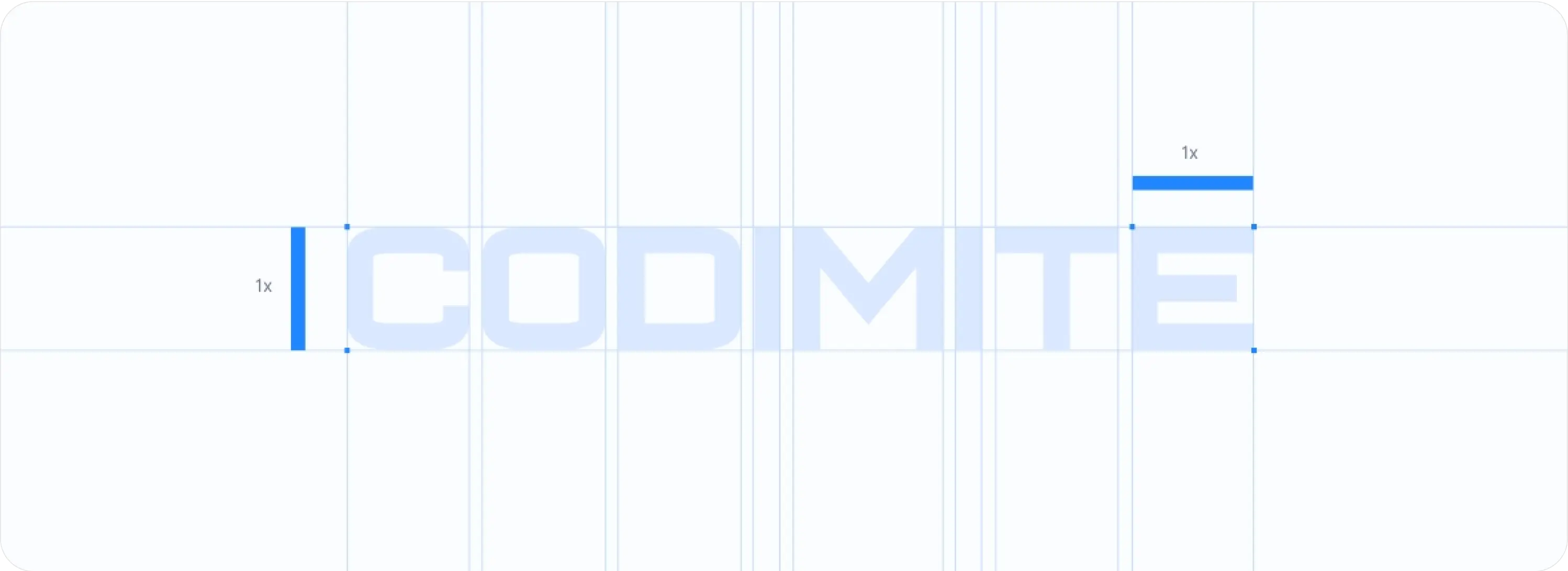
The width of the logo is shown as “1x,” indicating the relationship between the height and width. This helps maintain the correct proportions when scaling the logo in various applications.
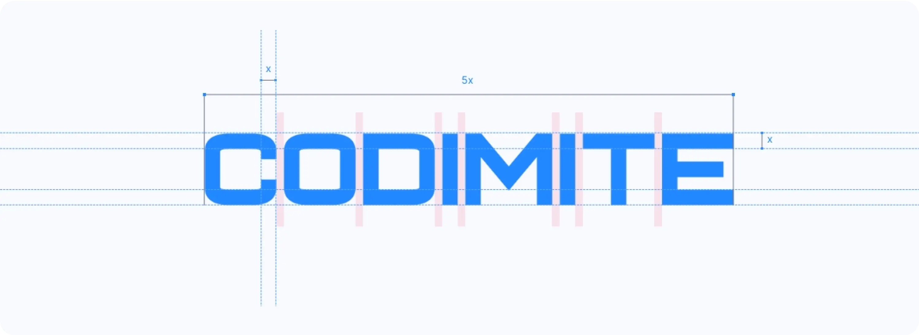
Vertical lines in the letters demonstrate precise spacing between elements in the logo. This ensures a balanced, symmetrical look and helps guide positioning in designs.
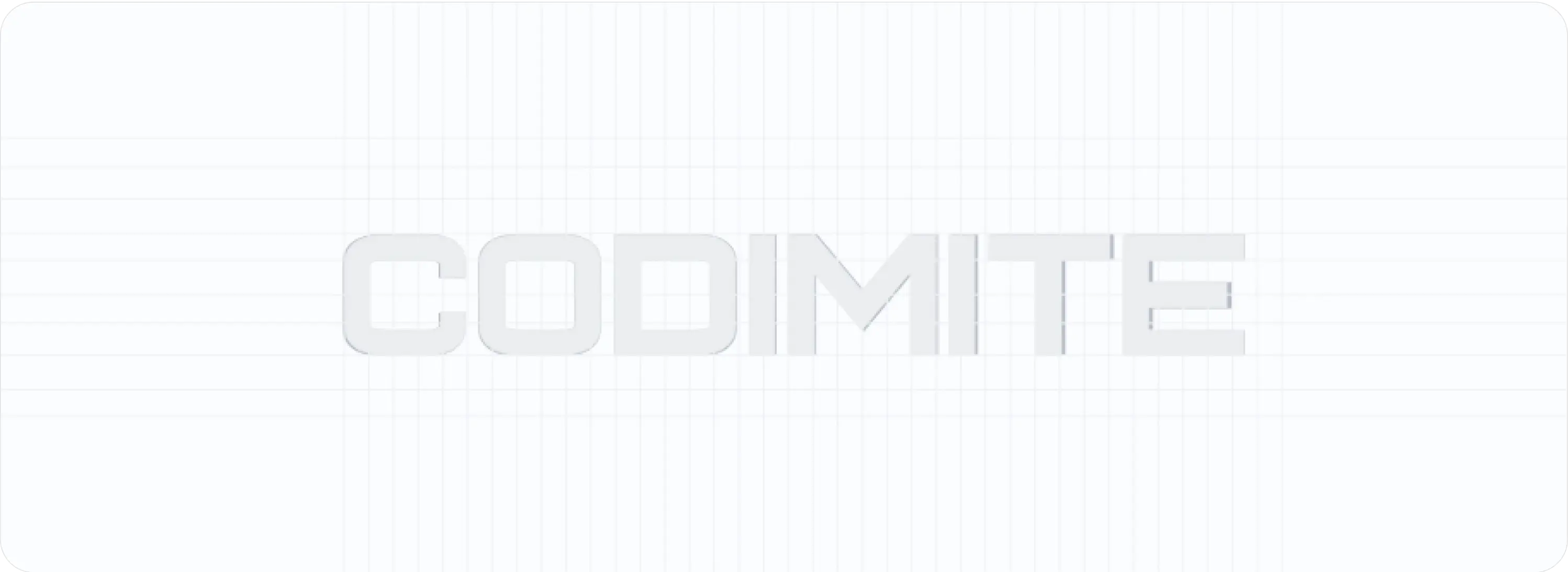
This grid structure establishes alignment rules for the logo, ensuring it's precisely centered and aligned in layouts. It helps designers place the logo consistently within different compositions.
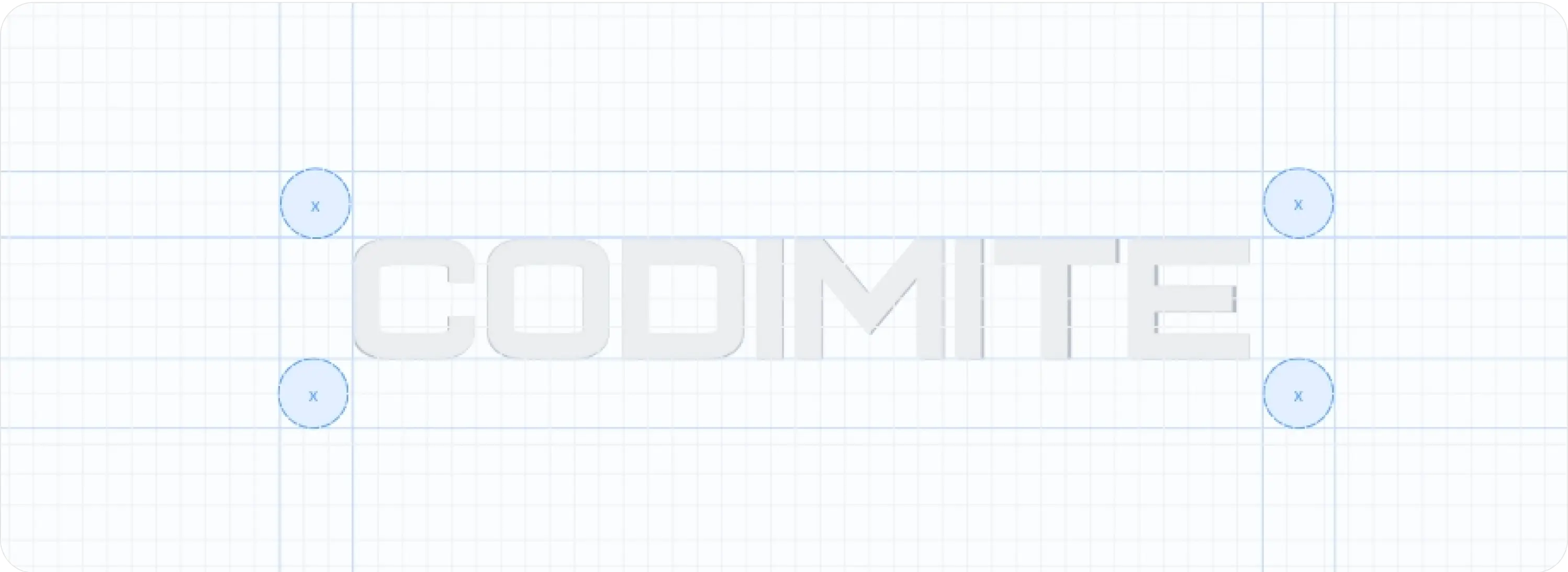
The “x” measurement defines the minimum clear space around the logo, ensuring nothing intrudes upon this area. This measurement is critical for maintaining visual integrity.
Logo Color



The logo color variations play a crucial role in establishing our brand identity. Each hue reflects our values and enhances recognition across various media, ensuring consistent visual impact.
Incorrect logo design

Do
Use the exact hex code or CMYK/RGB values from your brand guidelines. Share the logo in high-quality formats (SVG, PNG) to maintain color accuracy.
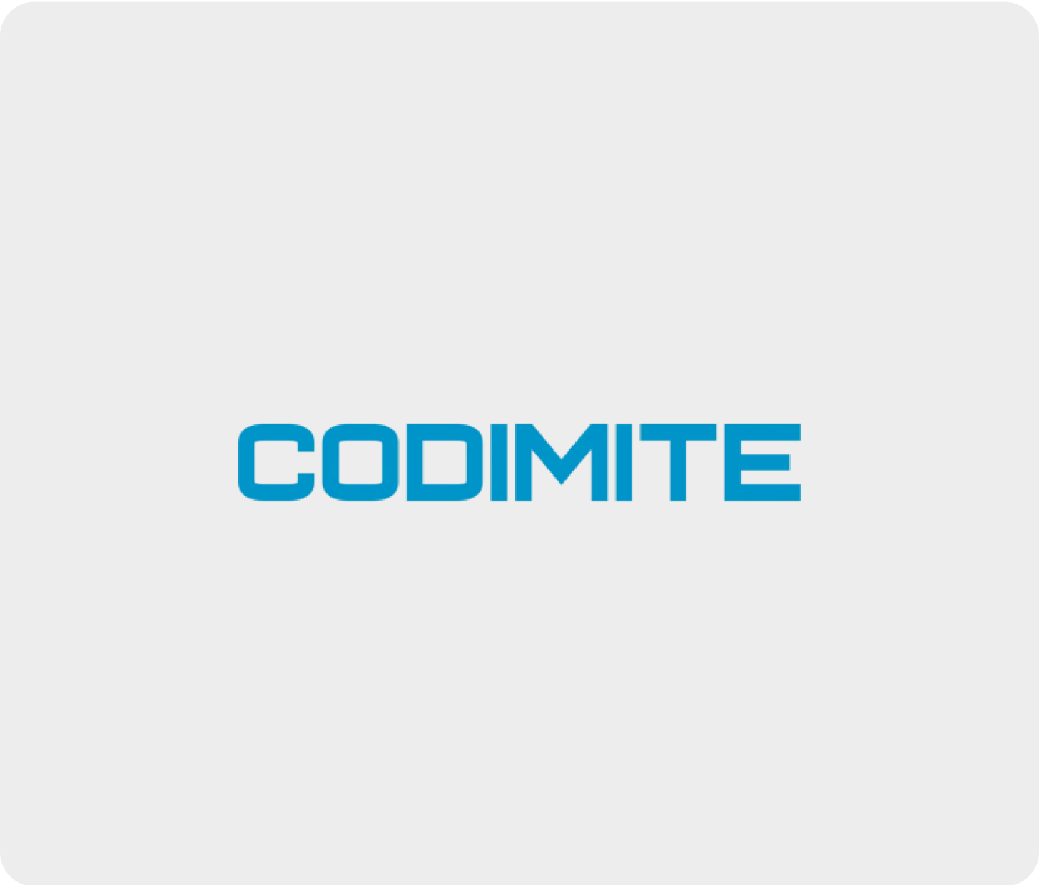
Don’t
Altering the logo’s blue tone weakens brand recognition and consistency, as different shades can convey varied moods or messages.
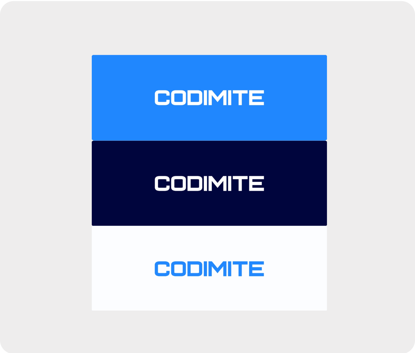
Do
Use white, light gray, or other neutral backgrounds from your brand guidelines. Avoid blue tones to ensure contrast.
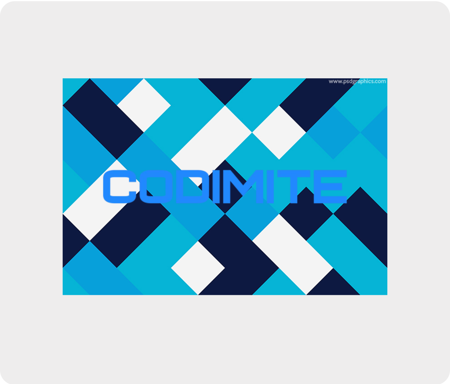
Don’t
Avoid textured or patterned backgrounds. For darker backgrounds, add a light box or "buffer" space to ensure clarity.
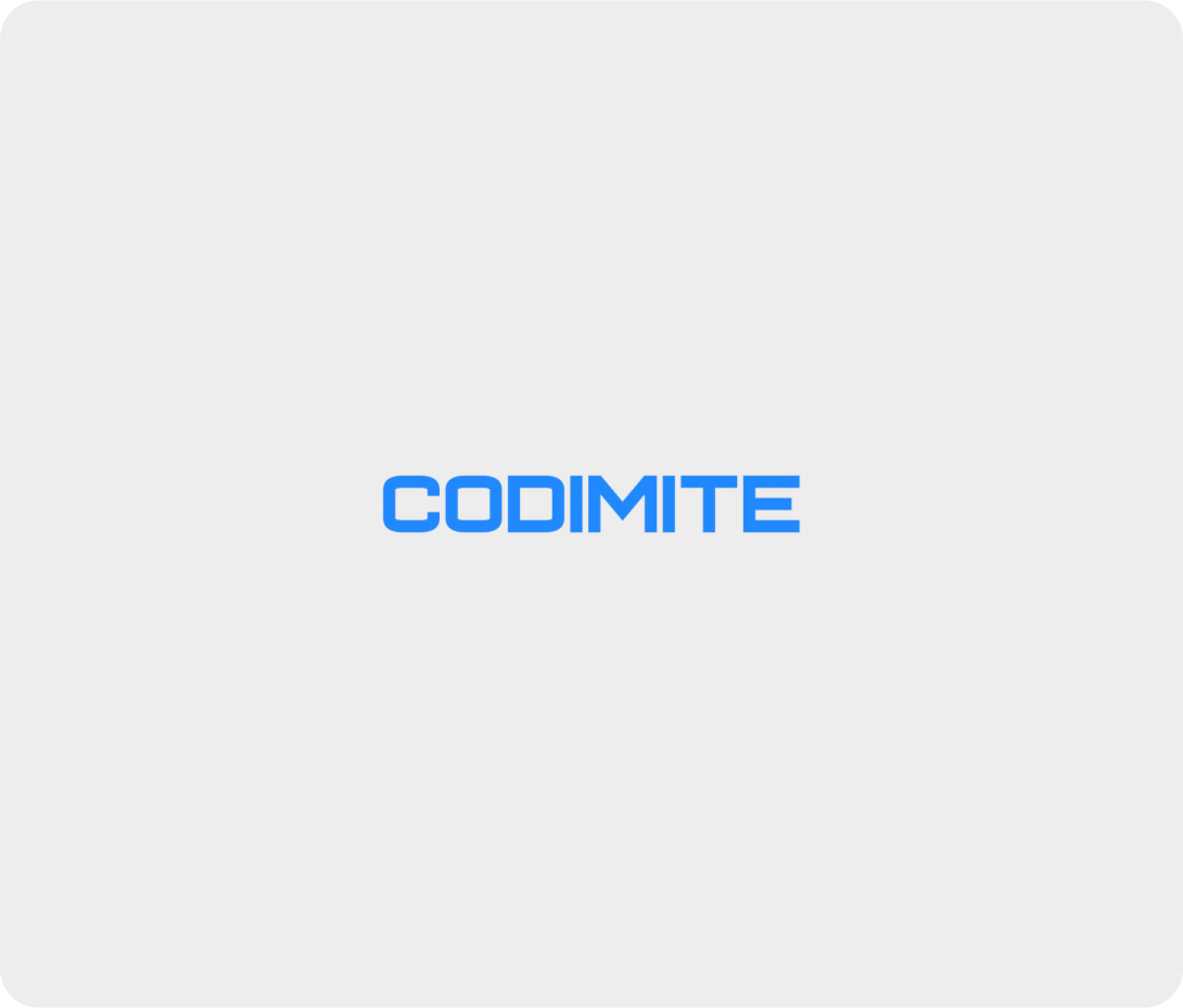
Do
When resizing the logo, use tools that lock the aspect ratio (e.g., hold the shift key) to maintain proportions.
Don’t
Keep the logo unboxed and complete. To separate it from the background, use approved backgrounds or a light border instead of cropping or enclosing it in a shape.
Mobile App
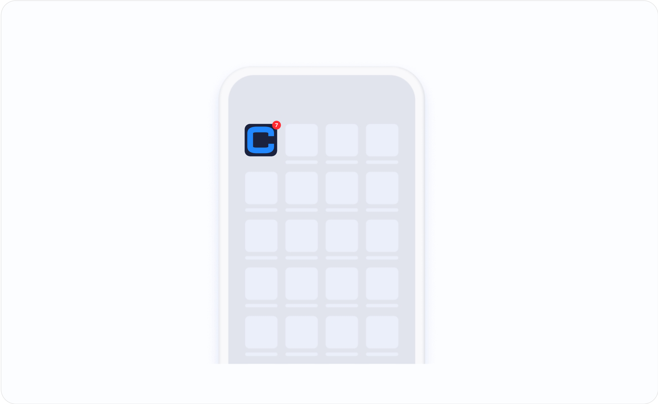

Our mobile app exemplifies user-centered design, providing seamless navigation and an intuitive interface. Explore features that enhance user experience while maintaining brand integrity.
Core Colors
Blue
HEX:3878FB
RGB : 56 120 251
Pastel Blue
HEX:bfd7fe
RGB : 191 215 54
Midnight Blue
HEX:080734
RGB : 8 7 52
Charcoal Black
HEX:131416
RGB : 19 20 22
Slate Gray
HEX:4b5767
RGB : 75 87 103
Light Powder Blue
HEX:dae1e9
RGB : 218 225 233
White
HEX:fff
RGB : 255 255 255
Typography
Inter
Aa
1#
Our typography focuses on clarity and legibility, using the Inter font family for a modern aesthetic. This selection enhances readability across digital platforms while maintaining a cohesive brand voice.
Light
AaBbCcdDdEeFf
1234( ) / &
Regular
AaBbCcdDdEeFf
1234( ) / &
Medium
AaBbCcdDdEeFf
1234( ) / &
Semi bold
AaBbCcdDdEeFf
1234( ) / &
Bold
AaBbCcdDdEeFf
1234( ) / &
Extra bold

