The Role of Microinteractions in Enhancing User Experience

Microinteractions are the small, often subtle, design elements that help users interact with a product. These include visual cues, animations, or audio feedback that guide, inform, or respond to the user's actions. Though they may seem minor, microinteractions play a significant role in enhancing the overall user experience (UX) by making interactions more intuitive, delightful, and engaging.
Why Microinteractions Matter
Microinteractions are essential for several reasons:
- Feedback: They provide instant feedback to the user, letting them know the system has acknowledged their action. For example, when you hit the "Like" button on a social media platform, the heart icon might animate to confirm your input.
- Guidance: They can guide users through tasks without needing a tutorial or written instructions. For instance, an animation might indicate that more content is available by pulling down a menu.
- Enhanced Usability: Well-designed microinteractions improve usability by making interactions feel more natural. They reduce friction and make tasks feel more fluid and enjoyable.
- Emotional Engagement: Microinteractions can add personality to a product, creating emotional engagement. Fun animations or subtle visual effects can create moments of joy and leave a lasting impression on users.
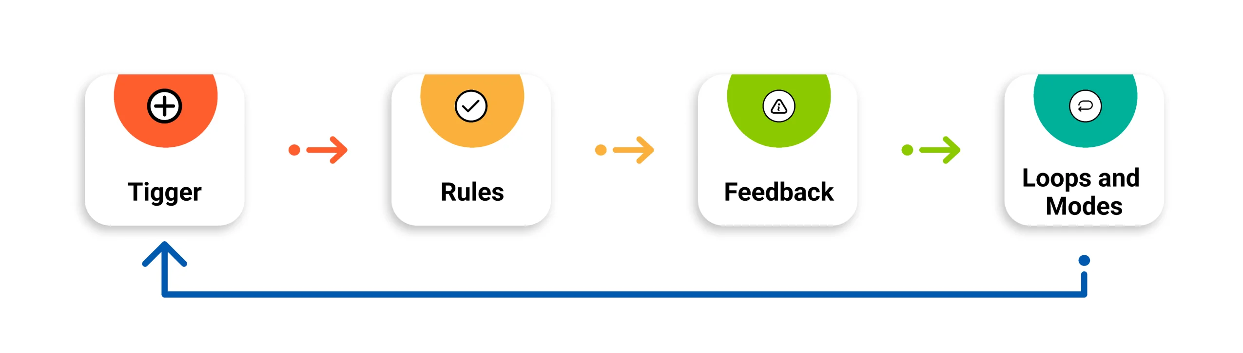
Core Components of Microinteractions
Microinteractions are essential for several reasons:
- Trigger: The action that initiates the microinteraction. It could be user-driven (e.g., clicking a button) or system-driven (e.g., receiving a notification).
- Rules: Define what happens after the trigger occurs. For example, if a user clicks a button, the rule determines the next step, like animating a loading spinner.
- Feedback: The system response to the user's action. Feedback is often visual (e.g., color change) or tactile (e.g., vibration).
- Loops and Modes: Control what happens if the action repeats or changes. This component manages long-term effects and determines whether the interaction stays the same or evolves over time.
Examples of Microinteractions
Microinteractions are essential for several reasons:
1. Pull-to-Refresh Animation
- Example: In apps like Twitter or Instagram, when you pull down on the screen to refresh the content, a visual cue (such as a loading spinner or icon) appears.
- Why It Works: This interaction informs the user that their action is successfully refreshing the page while also creating a satisfying, familiar experience.
2. Like Button Animation
- Example: Facebook’s "Like" button offers an animated burst of color when clicked. Similarly, on Instagram, a heart icon grows larger momentarily when a post is liked.
- Why It Works: This small animation provides feedback and makes the action feel rewarding, reinforcing the user’s engagement.
3. Form Field Validation
- Example: When filling out a form, fields may change color to green if entered correctly, or red if there’s an error, with an accompanying message like "Invalid email format."
- Why It Works: This immediate feedback helps users quickly correct mistakes without needing to submit the form and wait for a server response, streamlining the process.
4. Progress Indicators
- Example: When uploading a file or processing an action, a progress bar or spinner appears to show that the system is working on the task.
- Why It Works: A progress indicator reduces anxiety by letting users know the system is processing their request, making the waiting time feel less frustrating.
5. Toggle Switches
- Example: Many apps use animated toggle switches to represent on/off states. The smooth transition and color change (e.g., from gray to green) make it clear when a setting is active or inactive.
- Why It Works: The animation makes it visually obvious what action has been taken, improving clarity and enhancing the user's control over the interface.
Best Practices for Designing Microinteractions
- Keep Them Simple: Microinteractions should be subtle and not distract users from their main task. Overcomplicated animations can be overwhelming.
- Prioritize Function: Every microinteraction should serve a purpose. Avoid adding animations or feedback for the sake of decoration; they should enhance usability and understanding.
- Match the Brand Tone: The style of your microinteractions should align with your brand. For instance, a playful app might use bouncy animations, while a professional one might opt for more subtle transitions.
- Test for Accessibility: Ensure that microinteractions don’t hinder accessibility. For example, avoid relying solely on color changes for feedback, as users with color blindness might not perceive them. Consider adding haptic feedback for mobile users or audio cues for users with visual impairments.
Microinteractions, though small, are a powerful tool in UX design. They enhance user experience by providing clear feedback, reducing confusion, and creating enjoyable moments of interaction. By focusing on the details, designers can craft a more intuitive, engaging, and delightful user journey.