Accessibility in UX: Designing for Color-Blind Users
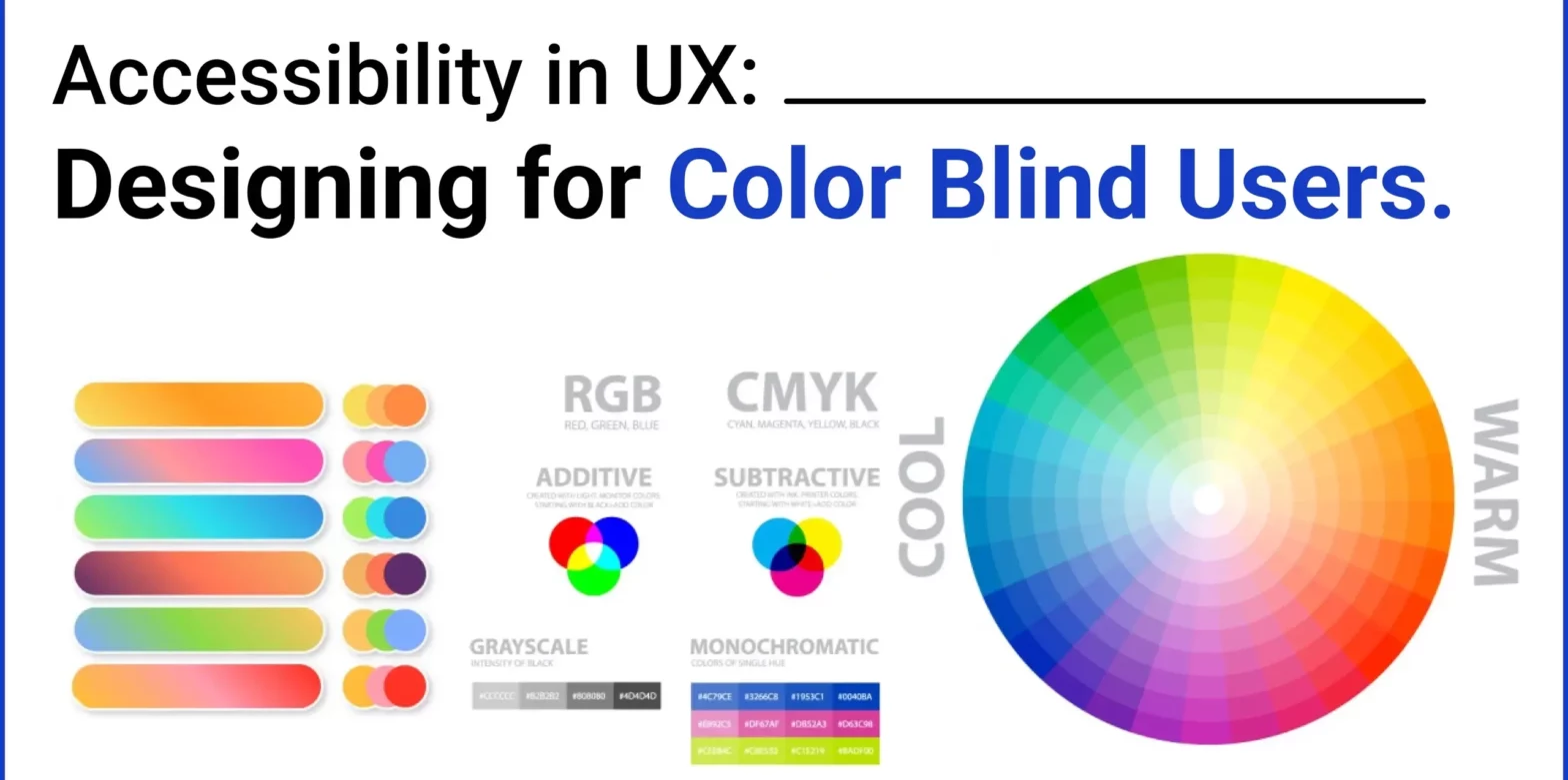
Creating an inclusive user experience (UX) is essential for ensuring that digital products are accessible to everyone, including those with color blindness. Approximately 8% of men and 0.5% of women worldwide have some form of color vision deficiency, which means that relying solely on color to convey information can hinder their ability to navigate and understand digital interfaces effectively. This article delves into practical strategies and use cases for designing UX that is accessible to color-blind users, complete with image examples to illustrate key points.
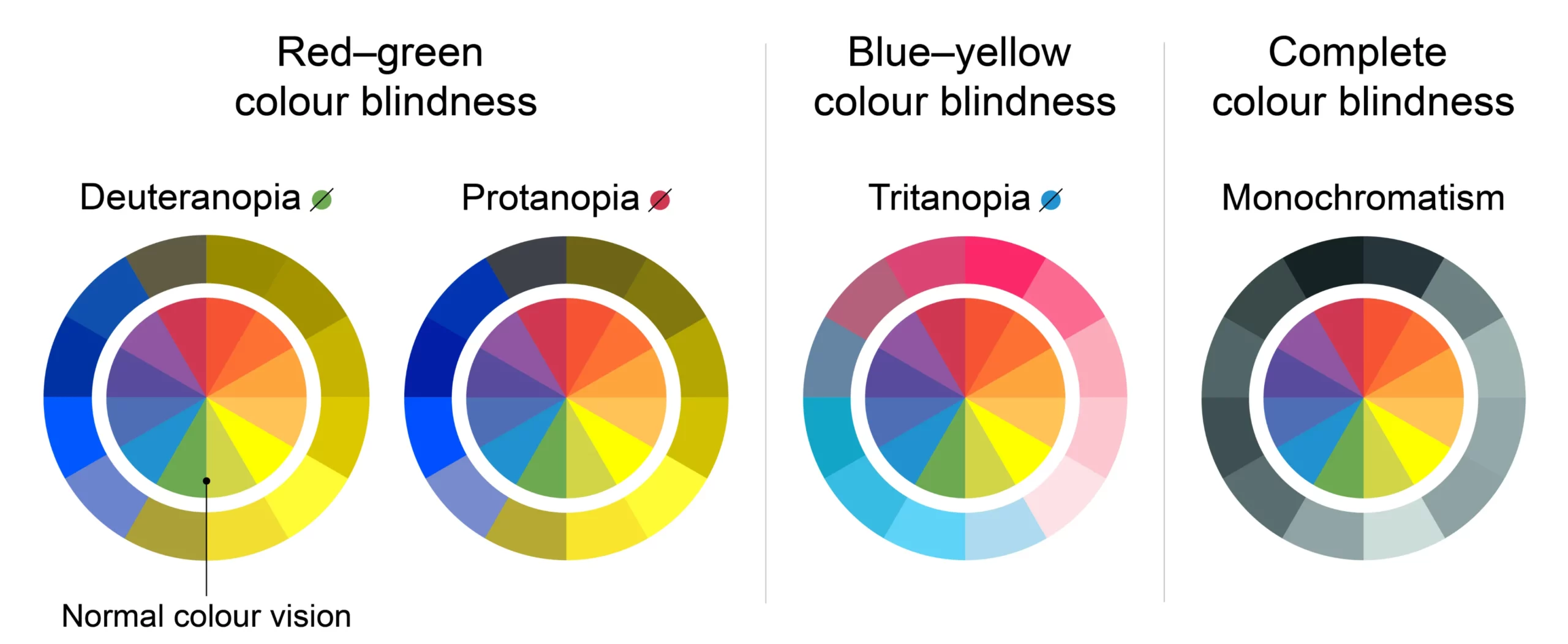 Each type affects color perception differently, so designs that rely heavily on color need alternative methods to convey information effectively.



Understanding Color Blindness
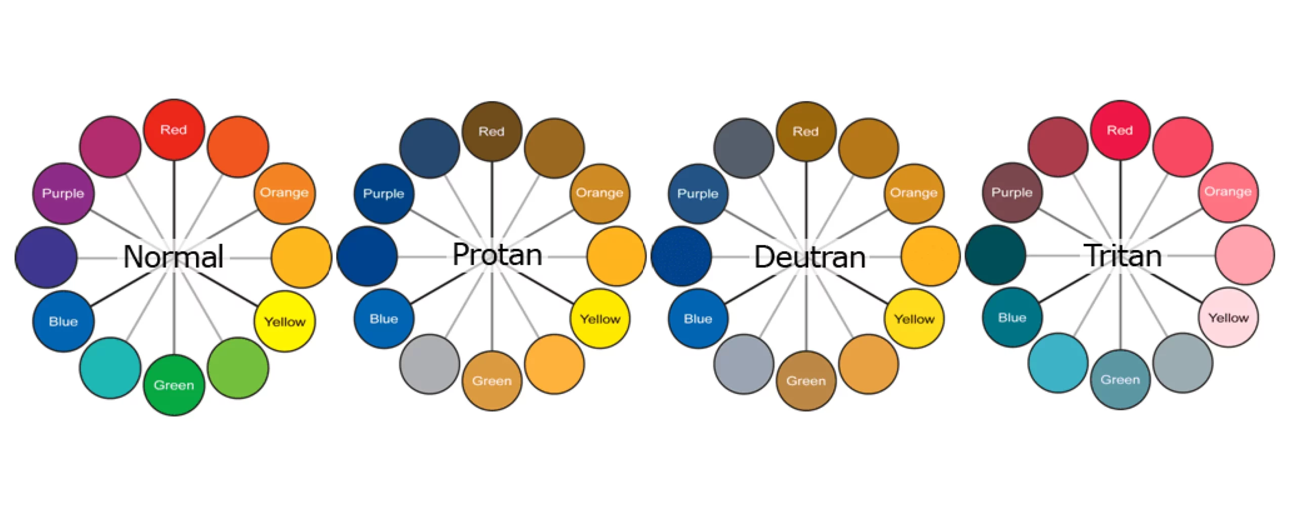
Color blindness, or color vision deficiency, affects how individuals perceive colors, particularly red, green, and blue hues. The most common types include:- Deuteranopia/Deuteranomaly (Red-Green): Difficulty distinguishing between red and green.
- Protanopia/Protanomaly (Red-Green): Red appears muted, making it difficult to differentiate from green.
- Tritanopia/Tritanomaly (Blue-Yellow): Difficulty distinguishing between blue and yellow.

Best Practices for Designing for Color-Blind Users
1. Use High Contrast Colors
High contrast is critical for readability and visual clarity. For text and backgrounds, aim for a contrast ratio of at least 4.5:1. For larger text, a 3:1 ratio is acceptable. Example: Imagine a call-to-action button. Instead of using a light green button with white text, which is hard to distinguish for some users, opt for a dark green button with white text or use a different shape or border to highlight the button.
2. Avoid Relying Solely on Color to Convey Information
Do not use color alone to communicate critical information, such as errors or statuses. Combine colors with text, symbols, or patterns. Use Case: In a form, instead of highlighting an error field in red only, add an error message such as “This field is required” along with an icon.
3. Utilize Patterns and Textures in Data Visualizations
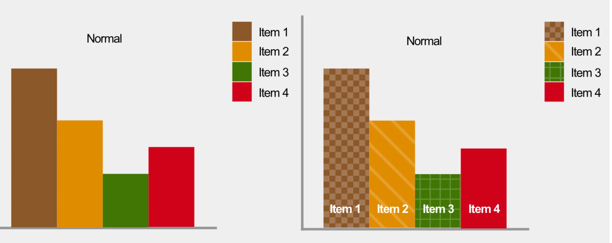
Charts and graphs should include patterns or textures alongside colors to differentiate data sets. This ensures that users can understand the data even if they cannot distinguish between the colors. Use Case: In a bar chart, use different patterns (e.g., stripes, dots) for each bar segment along with distinct colors.
4. Choose Color-Blind Friendly Palettes
Use palettes that are distinguishable for all users. Tools like ColorBrewer provide pre-made color schemes that cater to color-blind users. Use Case: When designing a website theme, select colors that vary in both hue and brightness to ensure contrast and legibility.
5. Provide Text Labels for Interactive Elements
Ensure that all interactive elements like buttons, icons, and links have clear text labels or tooltips to describe their function. Use Case: On a navigation menu, instead of using only colored icons, add text labels like “Home,” “Profile,” and “Settings” to help users identify the purpose of each icon.
6. Test with Color-Blind Simulators
Use tools like Stark or Color Oracle to simulate how your designs will appear to users with different types of color blindness. This allows you to make adjustments before launch. Use Case: Before finalizing a design, simulate it under various color blindness conditions to check if all users can access critical information.Tools and Resources for Designing for Color-Blind Users
- Stark: A suite of tools for checking contrast and simulating color blindness in design software like Sketch, Figma, and Adobe XD.
- Color Oracle: A desktop application that simulates color blindness across your screen.
- WebAIM Contrast Checker: An online tool to verify that your text and background color combinations meet WCAG standards.
- ColorBrewer: A resource for selecting color-blind friendly palettes, especially useful for data visualization.
Y Abeysinghe
UI/UX Engineer