Applying Dark Mode in Next.js using CSS Variables

Tailwind CSS for Utility Classes
First, let’s set up Tailwind CSS in our Next.js project. Tailwind provides a utility-first approach to styling, which can significantly speed up our development process. To install Tailwind CSS, run the following commands in your project directory:npm install -D tailwindcss postcss autoprefixer
npx tailwindcss init -p/** @type {import('tailwindcss').Config} */
module.exports = {
content: [
"./app/**/*.{js,ts,jsx,tsx,mdx}",
"./pages/**/*.{js,ts,jsx,tsx,mdx}",
"./components/**/*.{js,ts,jsx,tsx,mdx}",
// Or if using `src` directory:
"./src/**/*.{js,ts,jsx,tsx,mdx}",
],
theme: {
extend: {},
},
plugins: [],
}
@tailwind base;
@tailwind components;
@tailwind utilities;
Orea Color Generator for Color Palette

To create a harmonious color palette for both light and dark modes, we can use the Orea Color Generator. This tool helps in generating a set of colors that work well together and can be easily adapted for different themes.
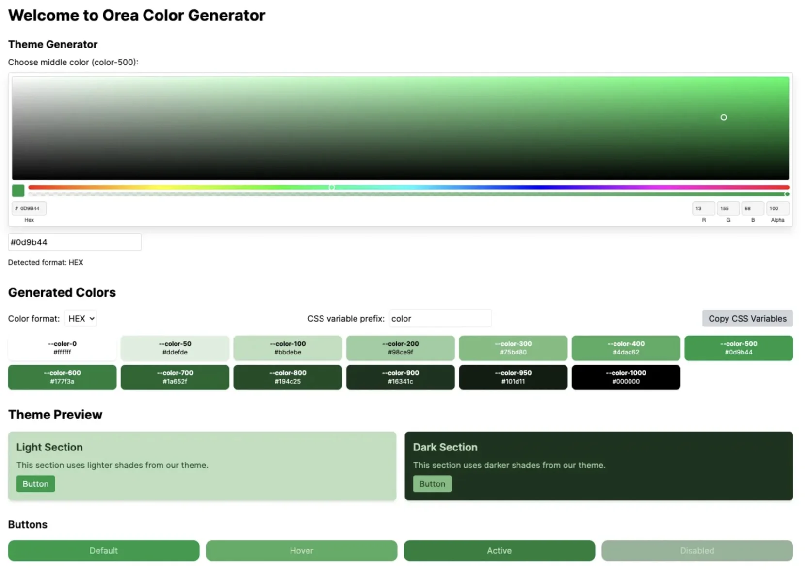
Visit the Orea Color Generatorand select your base colors. The tool provides a user-friendly interface to create and visualize your color scheme:
The image above shows the Orea Color Generator interface, where you can:
- Choose a middle color using the color picker
- View generated colors in various shades
- See a preview of your theme in both light and dark modes
- Copy CSS variables for easy integration into your project
After generating your color palette with the Orea Color Generator, you’ll want to implement these colors in your project. Here’s an example of how you can define your color variables in CSS:
:root {
  /* Initially TailwindCSS bg-opacity */
  --tw-bg-opacity: 1;

  --primary-50: 242, 242, 242;
  --primary-100: 230, 230, 230;
  --primary-200: 204, 204, 204;
  --primary-300: 179, 179, 179;
  --primary-400: 153, 153, 153;
  --primary-500: 128, 128, 128;
  --primary-600: 102, 102, 102;
  --primary-700: 77, 77, 77;
  --primary-800: 51, 51, 51;
  --primary-900: 26, 26, 26;
  --primary-950: 13, 13, 13;
}
These CSS variables define a range of shades for your primary color, from lighter color ( — primary-50) to dark colors ( — primary-950). By using these variables, you can easily apply consistent colors throughout your application and switch between light and dark modes.
Now that we have our color variables defined, let’s integrate them into our Tailwind CSS configuration:
module.exports = {
  // ... other config
  theme: {
    extend: {
      colors: {
        primary: {
          '50': 'rgba(var(--primary-50), var(--tw-bg-opacity))',
          '100': 'rgba(var(--primary-100), var(--tw-bg-opacity))',
          '200': 'rgba(var(--primary-200), var(--tw-bg-opacity))',
          '300': 'rgba(var(--primary-300), var(--tw-bg-opacity))',
          '400': 'rgba(var(--primary-400), var(--tw-bg-opacity))',
          '500': 'rgba(var(--primary-500), var(--tw-bg-opacity))',
          '600': 'rgba(var(--primary-600), var(--tw-bg-opacity))',
          '700': 'rgba(var(--primary-700), var(--tw-bg-opacity))',
          '800': 'rgba(var(--primary-800), var(--tw-bg-opacity))',
          '900': 'rgba(var(--primary-900), var(--tw-bg-opacity))',
          '950': 'rgba(var(--primary-950), var(--tw-bg-opacity))',
        },
      },
    },
  },
}
This configuration allows you to use these colors in your Tailwind classes, like `bg-primary-500` or `text-primary-200`, while still maintaining the ability to apply opacity using Tailwind’s opacity modifiers.
next-themes Package for Dark/Light Mode Theme
The `next-themes` package provides an easy way to add dark mode to your Next.js application. Let’s install and implement it:
npm install next-themesAfter installation, we need to set up our basic theme variables. Create a new CSS file (e.g., `globals.css`) or add to your existing one:
// app/layout.jsx
:root {
  /* Add your light mode colors */
  --tw-bg-opacity: 1;

  --primary-50: 242, 242, 242;
  --primary-100: 230, 230, 230;
  --primary-200: 204, 204, 204;
  --primary-300: 179, 179, 179;
}

[data-theme='dark'] {

/* Add your dark mode colors */
  --primary-50: 13, 13, 13;
  --primary-100: 26, 26, 26;
  --primary-200: 51, 51, 51;
  --primary-300: 77, 77, 77;
}
This CSS defines basic color variables for light and dark themes. The `[data-theme=’dark’]` selector will be automatically applied by next-themes when the dark mode is active.
Now, let’s implement the ThemeProvider in your `layout.tsx` file:
// app/layout.jsx

"use client";

import { ThemeProvider } from 'next-themes'

export default function Layout({ children }) {
  return (
     <html suppressHydrationWarning>
       <head />
       <body>
         <ThemeProvider>{children}</ThemeProvider>
       </body>
     </html>
  )
}
In your components, you can now use the `useTheme` hook to access and change the current theme:
"use client";

import { useTheme } from 'next-themes'

const ThemeChanger = () => {
  const { theme, setTheme } = useTheme()

  return (
    <div>
      The current theme is: {theme}
       <button onClick={() => setTheme('light')}>Light Mode </button>
       <button onClick={() => setTheme('dark')}>Dark Mode </button>
    </div>
  )
}

export default ThemeChanger
This setup allows for a smooth transition between light and dark modes, with the theme being persisted across page reloads.
Dropdown for Theme Toggle using shadcn/ui
For a more polished UI, we can use the dropdown component from shadcn/ui to create a theme toggle. First, install the necessary components:
npx shadcn-ui@latest add dropdown-menuNow, let’s implement our theme toggle:
import { useTheme } from "next-themes"
import { Button } from "@/components/ui/button"
import {
  DropdownMenu,
  DropdownMenuContent,
  DropdownMenuItem,
  DropdownMenuTrigger,
} from "@/components/ui/dropdown-menu"
import { Sun, Moon } from "lucide-react"

export function ThemeToggle() {
  const { setTheme } = useTheme()

  return (
    <DropdownMenu>
       <DropdownMenuTrigger asChild>
         <Button variant="outline" size="icon">
           <Sun className="h-[1.2rem] w-[1.2rem] rotate-0 scale-100 transition-all dark:-rotate-90 dark:scale-0" />
           <Moon className="absolute h-[1.2rem] w-[1.2rem] rotate-90 scale-0 transition-all dark:rotate-0 dark:scale-100" />
           <span className="sr-only">Toggle theme</span>
         </Button>
       </DropdownMenuTrigger>
       <DropdownMenuContent align="end">
         <DropdownMenuItem onClick={() => setTheme("light")}>
          Light
         </DropdownMenuItem>
         <DropdownMenuItem onClick={() => setTheme("dark")}>
          Dark
         </DropdownMenuItem>
         <DropdownMenuItem onClick={() => setTheme("system")}>
          System
         </DropdownMenuItem>
      </DropdownMenuContent>
     </DropdownMenu>
  )
}
This component creates a dropdown menu with options to switch between light, dark, and system themes. The button uses sun and moon icons to visually represent the current theme.
Conclusion
Implementing dark mode in a Next.js application using CSS variables, Tailwind CSS, and next-themes provides a flexible and maintainable solution. Here’s a summary of what we’ve achieved:
- We set up Tailwind CSS for utility-first styling.
- We used the Orea Color Generator to create a consistent color palette for both light and dark modes.
- We implemented theme switching using next-themes, allowing for easy toggling between light and dark modes.
- We created a polished theme toggle component using shadcn/ui, enhancing the user experience.
By leveraging CSS variables, we’ve created a system that’s easy to maintain and extend. The use of next-themes ensures that our theme preference is persisted, providing a seamless experience for users.
Remember these key points when implementing dark mode:
- Always consider accessibility and ensure sufficient contrast in both themes.
- Test your application thoroughly in both light and dark modes.
- Consider using prefers-color-scheme media query to respect the user’s system preferences.
- Be consistent with your theming across all components and pages.
With this setup, you’re well-equipped to provide a modern, user-friendly dark mode option in your Next.js application. Happy coding!